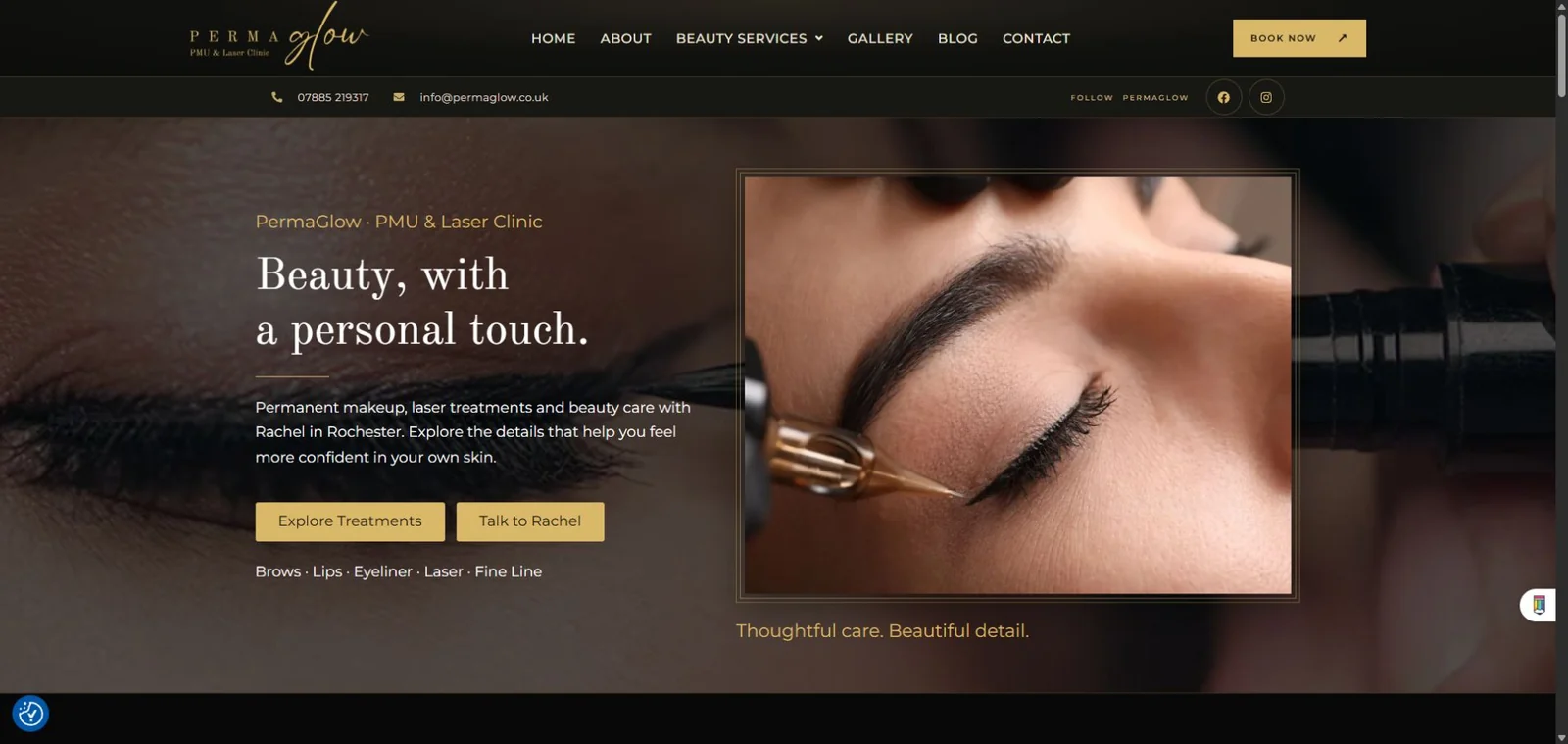
PermaGlow website design for a permanent makeup and laser clinic in Rochester. I designed and built this WordPress website with elegant presentation and straightforward navigation at its heart.
A confident first impression: a clear introduction, treatment photography and two direct routes to explore services or get in touch.
BusinessPermaGlow · Beauty & aesthetics
My workWebsite design & development
PlatformWordPress · Elementor
The design focus
PermaGlow website design. The thinking behind the details.
PermaGlow offers several treatments, from permanent makeup to laser treatments and fine line tattoos. The website brings those different services into one consistent experience, while keeping Rachel, the person behind the business, visible and approachable.
The result is a clean, elegant presentation with a distinctive black-and-gold palette. Generous spacing, expressive headings and carefully placed photography give each section room to breathe. The pages feel connected without making every piece of information compete for attention.
Clarity before the next click.
The main navigation uses familiar labels, with beauty services grouped together and direct links to the gallery, about page and contact information. On the services page, treatment links help visitors move to the area they are interested in before exploring the individual treatment pages.
Clear buttons give people a useful next step throughout the site: browse a treatment, meet Rachel, view the gallery or make an enquiry. The prominent Book Now button leads to the contact page, keeping the route to a conversation easy to find.
Design decisions
Refined presentation. Practical choices.
The visual details support the information people need when exploring a beauty and aesthetics business.
01
A consistent visual identity
Black backgrounds, warm gold accents and elegant typography give the site a polished, cohesive feel. The same styling carries through the homepage, treatment content and gallery.
02
Clear content hierarchy
Short introductions, descriptive headings and well-spaced sections make the content easier to scan. Visitors can see the broad treatment options before reading the details.
03
Photography with a purpose
Treatment imagery introduces the services, while the gallery offers a closer look at Rachel’s work. Photographs are grouped into recognisable collections rather than presented as an undifferentiated list.
04
Easy-to-follow navigation
Familiar menu labels and treatment links help people orient themselves. Contextual buttons connect the content to relevant service pages and the contact route.
05
A personal introduction
The Meet Rachel section gives the website a human point of connection. It introduces the person visitors will be speaking to and complements the treatment information.
06
A layout that adapts
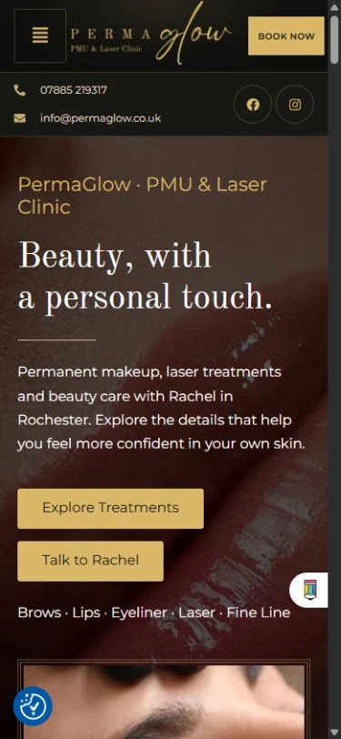
The mobile layout stacks the content, introduces a compact menu and keeps treatment and enquiry buttons visible within the reading journey.
A closer look
From the gallery to the mobile experience.
Actual screenshots of the live website, captured on 3 November 2026. Select an image to view it at a larger size.
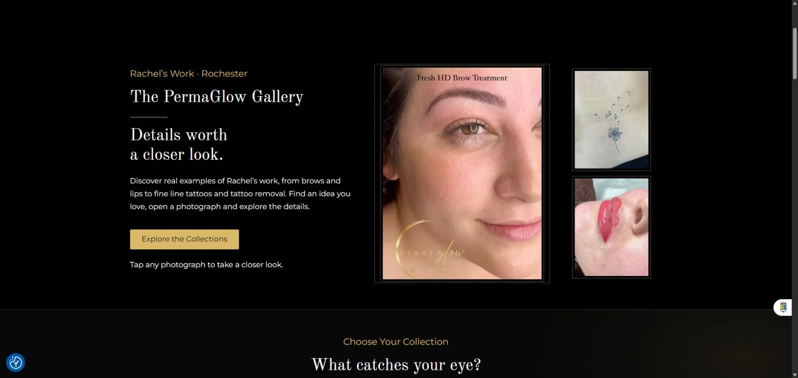
Gallery · Desktop
The gallery combines an introduction with treatment photographs and links into the different collections, giving the imagery a clear structure.
Homepage · Mobile
A compact header and stacked content keep the introduction and next steps readable on a smaller screen.
The finished website
Clear, clean and full of character.
PermaGlow shows how a small-business website can feel distinctive without making the visitor work hard. The styling establishes the personality of the brand; the structure helps people explore the services and find their next step.
It is a real example of my website design and development work. Explore the live site to see the pages, navigation and gallery in context.
 ™